Overview
Well I’ve been officially running the RTM version of Windows 8 for two days now. I’d previously upgraded (‘bare metal’) from Windows 7 to Windows 8 Release Candidate a couple of weeks ago, so the experience is not exactly new for me.
Fresh Installation
The main difference at the moment is that my current install is actually a clean one – not an upgrade. I decided to start with a fresh, clean, slate. The main consequence was that I did not inherit any of my previous settings. This was most evident in terms of my desktop background and some personal settings.
Opting to use a ‘Microsoft Account’
The second major difference is that I decided to use a ‘Microsoft Account’ (Live ID) instead of a local user account this time round. I decide that if I was to adopt Windows 8 as a primary operating system on my laptop, I might as well buy into the intended experience.
Installations
Being clean, I installed Office 2010, Visual Studio 2012 (RTM) and SQL Server 2012. This is probably the main flavour of configuration I usually have (I prefer RTM versions, where possible). There seems to be a trend in the reduction of times the system needs to reboot. This is a good thing!
I also enabled the local Internet Information Services, which is enabled in the same way as it was under Windows Vista and Windows 7 (Control Panel –> Programs and Features –> Turn Windows features on or off. Just as a side note – it’s probably still best to install in the following order, as historically installing IIS later can cause problems:
- Office,
- IIS,
- SQL Server 2012,
- Visual Studio 2012
There are a couple of extra things I install (sort of by default):
- 7zip,
- Prish photo resizer,
- Windows Live Writer & Messenger,
- Skype,
- Combined Community Codec Pack,
- VLC Player,
- Winamp (I’m old school!)
Plus I have a “toolkit” which I copy by default – it contains some standard SysInternals applications plus some additional developer tools which I’ve found handy over the years. You can get the whole SysInternals suite here.
Personalization
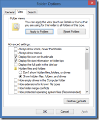
One of the first things I do is to establish a few system-side personalizations. For starters, I make a couple of changes to Windows Explorer, so that it doesn’t hide file extensions (what a stupid setting), and that it shows me all files and folders (only recommended for users who know what they’re doing).
Next, I wanted to use my own photo for the Windows 8 lock screen. After some digging, I found this on the left hand side screen under Settings –> Change PC Settings –> Personalize. There’s a “Lock Screen” option on the left hand side. You can browse to and select a photo of your own choosing. Here’s mine, by the way:
In the RTM version, there’s no way to select your own background image for the (formerly named ‘Metro’) Windows 8 Style UI. You can only select from some selected images and a custom base colour. A reason suggested for this change (from the earlier pre-releases) was that, due to the expanding nature of the formerly-metro UI, a user-specified image wouldn’t work.
I have some bitmaps which tile well, I’d have liked to have seen what it looked like. In usual Redmond fashion, the removal of functionality has been downplayed with suggestions that since you’d hardly be able to see it, it wouldn’t be a big deal. Why not let users decide for themselves? I suggest that users should have been given the choice regardless.
Windows 8 without a touch screen
Since I don’t possess a touch screen, it’s hard for me to review the touch interaction. Windows 8 without a touch screen can be a bit of a nightmare at times. In some circumstances, it appears obvious that touch was the primary consideration, such as when viewing images in the Metro image viewer.
Other examples include when splitting the screen and dragging/resizing metro apps. This must be a cleaner interface for touch gestures than with the mouse. Unfortunately the mouse experience (for me at least) has been somewhat counter-intuitive.
Windows Explorer, where for art thou?
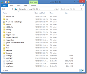
The explorer shell continues to receive facelifts with each successive release of Windows. This time around there’s endless clutter, but this can be cleaned up with a few mouse clicks.
The ribbon bar marks a fairly significant change, and so far I haven’t been able to find a way to view a menu bar. This means I’m stuck with the ribbon (for now) and I have to say, I’m not a huge fan of the ribbon over a traditional menu. A menu takes up considerably less screen real estate, and requires less clicks to access the settings/commands I want.
Speaking of.. the one most drastic user interface change I noticed was the flattening and ‘boxy’ nature of the new windows user interface. I’m not sure I quite like it. I’d been quite happy with Windows 7 and its predecessors, the new UI feels like a step backwards.
No Start Menu
This change has been somewhat controversial, but what I’m going to say on the matter might surprise you.
According to Microsoft’s review of user feedback, they claim that few users are using the Start menu, and instead are launching most applications from pinned task bar shortcuts. I know that I used the start menu heavily, so I wonder if their research wasn’t either too limited or not comprehensive enough.
I’m actually OK with the start menu being replaced by formerly-Metro. It was a shock when I noticed its absence in the early pre-releases, but since I’ve been running on ‘bare metal’ (from the Release Candidate) and now the RTM, I’m becoming quite accustomed to hitting the Windows key and just typing.
Although the user experience is markedly different (whole screen changing instead of just the lower left hand corner), the extra real estate is good, and it’s becoming less and less obtrusive as I get used to it. Fundamentally, the new formerly-Metro UI is much more functional, and it’s been growing on me each day now.
Faster.
The operating system sure boots faster. No argument from me. Whether the OS performs faster, I think, is debatable. For starters, I’m having to use the WDM drivers as none of my previous drivers (for Windows 7 x64) appear to be compatible.
Time will tell, if I’m able to get a driver refresh, if the performance will be comparable. For now though, the newer operating system seems a little more sluggish. I have, however, noticed that CPU usage is down on average which, in turn, has meant slower fan speeds and that the laptop itself hasn’t gotten quite a hot.
Summary
Well, all things being equal, it’s still early days. There are a number of annoying things about Windows 8 which I’m not yet ready to pass judgement on. I’d say the jury is still out on the formerly-Metro display mode (and the apps within).
At this stage, if you are happy with Windows 7, you might find the jump to Windows 8 a bit hard to swallow; especially if you don’t own a touch screen. The “blockiness” of the user interface suits the Windows Phone and the Xbox, but I’m not sold on it for the desktop/personal computer.
I’ll revisit this in a few months, so stay tuned. Next up: a review of Visual Studio 2012 RTM.


