Recently I made the horrible mistake of installing the latest version of the usually reliable Windows Live suite. For everyday use, I generally use Windows Live Messenger and Windows Live Writer – both of which have been historically fairly stable until now. Where to begin??
Live Writer
This very useful application was a revelation a few years ago. Combined with the ability to add plugins and support for a wide variety of blogs, it’s been just shy of bliss to punch out blog articles.
Until now. The new version inexplicably freezes on regular occasions, and generally becomes unresponsive. They have integrated the Office 2007 toolbar “Ribbon” and basically hidden all the functionality in that hard-to-understand fashion.
Live Messenger
 OMG! They’ve killed Messenger. Simply put: it’s a disgrace. Below is a screen capture of the latest release and it’s a bonafide nightmare.
For an application whose purpose is to facilitate instant messenging communication, you’d be hard pressed to figure that out on first glance.
This is hideous
 The Contacts list has been squished into a small tree view control on the middle
right hand side and it can’t be resized. The rest of the screen is taken up
by this ridiculously huge social media page, resembling the “MSN Today”
screen (which I assume no one uses).
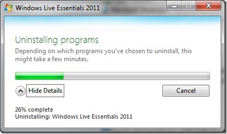
I’m uninstalling now, and I’ll probably move to a multi-IM solution (like the good
old days), or digging around trying to find an old installer for the releases
which resemble software written by people with some degree of sanity.
This version of Messenger should be burnt to a cinder, and the people responsible
for this insult to software should never be given jobs in the IT industry again.
Previous Version
Now, don’t get me wrong. I’m a big fan of these applications (normally) and I certainly appreciate the price tag (free), but when they take two applications which have been working so well and just destroy the usability, or stability it’s really hard to excuse.
Normally, these kind of changes would be tested in a Beta version before being released as an RTM version so that the community of religious users (such as myself) would have a chance to send feedback via the increasingly useful http://connect.microsoft.com but, alas, not this time.
If you want to witness this evil for yourself, you’ll find all you need here: http://explore.live.com/windows-live-essentials?os=other
Last word…


2 thoughts on “Microsoft Live Essentials 2011”
I totally agree with You on this. Messenger was the most UI friendly im on the market. On the last version You could select Send IM to and a nice simplyfied contacts list would apear letting You quickly send messages to anyone right from the taskbar. Now You need to open the main window to search for a contact. And what about the new Onlie/Offline scheme where You start messenger in offline mode then try to start taking to someone making Messenger requiring You to be online at least for that contact. When You select apear online to this contact, You are blocking everyone else so when You change from offline to online everyone is blocked so You need to again select Apear Online to all contacts to regain your Online status. And btw, a 155 mb installer??? Thats gross. They really messed up everything. I would really like some punishment for those decissions.
wow… the new MSN Messenger looks terrible