Regular readers of Sanders Technology will know (by now) that I’m not much of a user interface person. I started off in UX about 13 years ago, but gradually migrated into back-end systems like databases, data access design and web services.
Does this disqualify me from passing judgement on user interfaces? Hardly! As both a power user and early adopter I’m usually amongst the front lines when it comes to change. The latest releases from Microsoft have pushed the boundaries in terms of radical design and UX changes.
What we’re seeing out of Redmond this year is a good hard swing at a more ‘Applesque’ attention to user interfaces: cleaner, clearer and (unfortunately) perhaps a bit dumbed down.
The evolution away from this:
To a cleaner app like this:
Has taken come casualties in the process. Some of the more common knocks on the UI formerly-known-as-Metro is that it breaks with the traditional Windows interaction – switching contexts on a Windows 8 PC means changing the full screen.
But hey.. this article isn’t about “formerly-metro”, this is about a recent Microsoft rebranding. Microsoft has had a fairly stable brand for several decades. The current corporate signature logo has remained the same since 1987 and the Windows logo hasn’t changed too dramatically since Windows 3.0. Just take a trip back through memory lane:
So it was quite a surprise to see the Windows 8 logo in the following format:
On top of this change, moving away from the waving flat sort of design, we have word that the new official logo for the Windows 8 platform is:
Seriously? The first moment my eyes caught sight of this ugly logo, my mind sprinted backwards to my early childhood days. Sure enough, I’ve seen this logo before:
…on Play School (a popular children’s television program).
If it were April 1st, I’d assume this was an April Fool’s Day prank, but according to this:
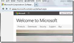
It’s for real. Want more proof? Check out microsoft.com:
Welcome to the new Microsoft. Try not to look at the logo.


