At the start of this month, Microsoft released another preview edition of the upcoming next edition to the Windows operating system franchise. This is Preview 10074, and contains a few very interesting changes. I ran up the Preview image earlier today to take a look at what’s new.
Installing Windows 10
It seems Microsoft is wedded on the concept of users specifying or creating a Microsoft Account to use their new operating system:
This, of course, is not exactly new as the concept of using Microsoft Accounts has been around since Windows 8.1. There is an alternative which can allow you to create a local account, although I haven’t tested this on the Windows 10 previews yet.
Logging in for the first time
Once we get past the usual install process and you’ve created an account (or associated it to an existing Microsoft account) you’ll get to authenticate and find yourself on the new Windows desktop. In my experience, the returning start menu wouldn’t respond.
At some point dropped into the control panel when I received this hint:
Signing out and back in again seems to finalise some configuration or settings and the Start menu responds:
Web Browsing Edge
Now that we’ve got that sorted, it was time to do some exploring (pardon the pun). I located something called “Project Spartan” which you can see from the Start Menu – third blue square on the top row. Of course I know that this was the codename for what has been unveiled as Microsoft Edge – the replacement for Internet Explorer.
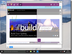
Sure enough, this preview version has an early version of Microsoft Edge included. I’m beginning to suspect that the name was chosen because the browser has almost no UI around the web page content – incredibly minimal toolbars. status bars etc.
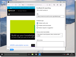
It also features functionality which allows you to overlay comments on web pages and to highlight sections of web pages:
Right, what else can we see?
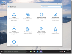
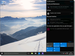
The “control panel” still features the redefined icons and layout, but the notification center (available via the system tray icon which looks like an IM icon) has gone on steroids and now covers more than a third of the screen when activated.
Sign in options include an ability for touchscreen enabled users to preselect a series of lines/circles overlaid on a picture as a “smart authentication” option, over PIN and standard passwords:
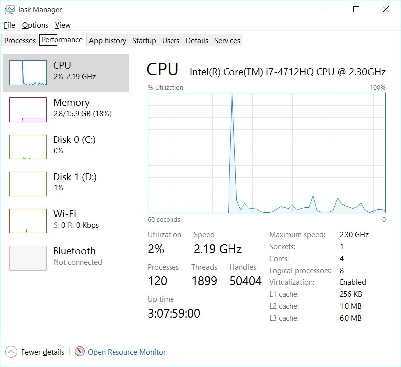
At one point the machine almost locked up due to the obscurely named “UnistackSvcGroup” of mysterious services decided to use 97% of the VM’s CPU for no apparent reason. Stopping one of the services fixed the problem, but I’ll have to investigate what that stuff does later.
Windows App Store
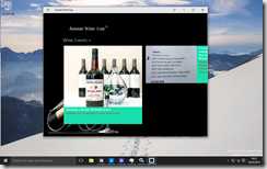
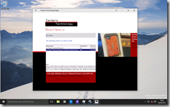
Since I used a Microsoft account, I was able to access the Windows App Store. Naturally, I installed my own Windows apps for testing purposes. You can obtain the Aussie Wine Guy or the Sanders Technology apps for free!
They load fine in the app container, but I found a performance problem when doing an initial resize of the container – the desktop locked up for about a minute.
Larger screen real estate helps, but the horizontal scrolling still seems a bit odd. Must fix that at some point.
That’s all for now as I really need/want to return to the Windows Server preview which I started looking at on Friday.


